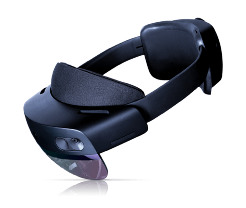
At the beginning we had to understand what’s that all about. Compared to the standard design process, we identified some significant challenges.
-
Perception: users understanding of mixed reality was limited, leading to misconceptions and assumptions when using this technology
-
Usability and Accessibility: As one of the pioneers in this field, we were faced with unique user interface problems that required unusual solutions, often picked up in the gaming industry.
-
Process: the design process for mixed reality was a new frontier, different from conventional UX/UI design methodology.
-
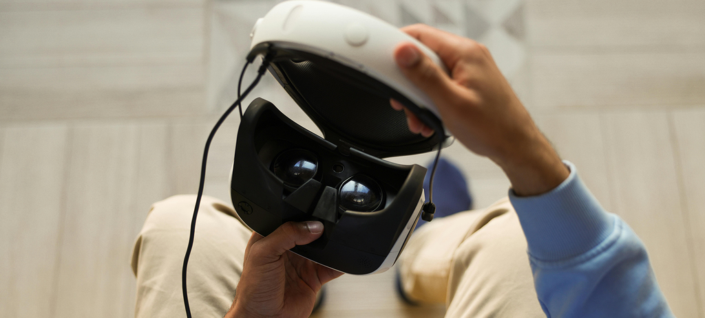
Rapid prototyping to understand the vision: We use a variety of methods for this, such as drawing, creating user-flow of the application using storyboards or simple 3D animation.
-
UX/UI design: We had to go beyond creating standard mockups and anticipate user behavior in the context of the real space that surrounds them, not just a monitor or phone screen.
-
3D design: An absolutely required skill to create augmented reality products is 3D design skills - we had to master 3D modeling, texturing or animation basics.
-
Mastering the 3D engine: Our task was to prepare everything the developers needed to create an aesthetically pleasing application on the engine of their choice - in our case Unity 3D, this mainly includes skills approaching the level design or level art known from the game industry. We had to be able to work seamlessly in this environment with the developers.
Step one - Vision and idea
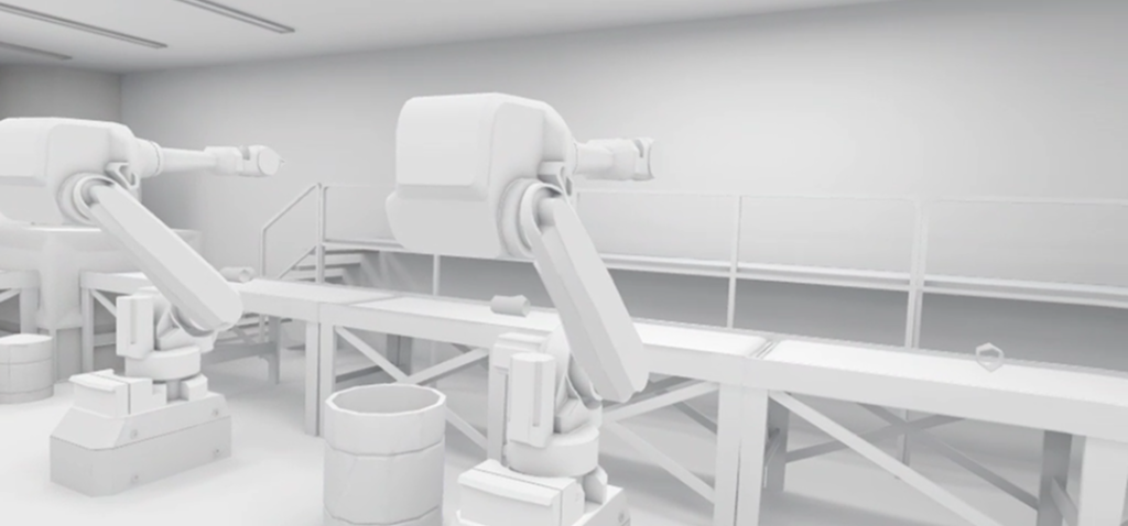
Our first steps in each application were to understand the scope of work and what we had to prepare. Most often, to communicate the vision to stakeholders, we used storyboards familiar from video development. Sometimes we drew or created 3D renders. We had to be sure that we and the client envisioned the same thing. This was difficult at first - it’s a much different approach than in web or mobile projects, where a few screens or a pitch deck are enough to discuss an idea. We drew inspiration from gamedev and video creation, where complex scenes often need to be shown in the simplest and most pictorial way possible.
Prototyping and Blockout
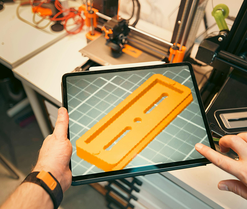
After the vision and understanding stage, we entered the blockout and prototyping phase. This strategy, borrowed from level design in games, offered an early sense of how the application would work. Using simple building blocks, we created augmented reality elements to put them into the engine and, consequently, into virtual reality as quickly as possible. This allowed us to understand how the app works without many hours of development. The photo on the right shows the idea for the 3D interface in the application.
UI in Augmented Reality
Designing for mobile or stationary devices is not so much simpler, but more “by rule of thumb”. - We know what kind of space we have, and we need to fit everything the user needs on it in an optimal way. But Mixed Reality (MR) presents a different challenge - we need to design an optimal interface, taking into account how each element of the real-world environment can affect the perception of the UI.Key issues in mixed reality UI design include:
- Adjusting the size and position of individual UI elements in space.
- Ensuring that the UI is visible at every stage, moving and rotating toward the user.
- Providing spatial indicators in case the UI is “lost” in space.
- Discrete UI - hiding it when unnecessary to maintain transparency.
- Determining the size of the text, taking into account the resolution of the device and the field of view and distance from the user.
Augmented reality interactions
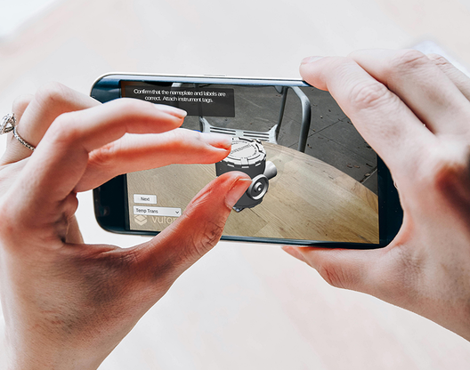
Interactivity shapes the way users experience the virtual world generated by their device. In mixed reality, interactivity is closer to our natural understanding of the world than screen-based interactions. It is crucial that users perceive what is interactive and what is not and understand how to interact with the environment.
Interactions in MR are similar to so-called game-literacy, a situation in which computer gamers naturally understand what actions they can perform in new games based on experience from previous games - it is natural for them to use the “WSAD” buttons to move around in any new game,. In MR, however, this intuition comes not from experience with games or apps, but from our perception of the real world and the interactions we make with it.
Taking advantage of user habits
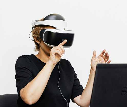
The methods described earlier may seem strange, but thinking logically if we want the user to rotate a 3D object - let him grab it and then turn it around. In this case, we can also use swipe gestures to give the object a rotational motion. In 3D space and augmented reality, we need to simulate behavior from the real world. Buttons are another example: users naturally try to press a small, distant button with their finger or pointer, and a larger, closer button with their whole hand. Well-designed interactions effectively guide users even when they are not aware of it, reassuring them that their way of interacting with an object is correct.
